Problem Statement
The previous designer of the application was not able to complete a satisfactory UI and UX design. The designer’s lack of experience and analysis used wrong dimensions for a mobile based application and induced numerous missing links. Consequently, it caused inconvenience during implementation and deployment stage of the application.
Goal
Building strong foundation in design through the application of standard dimensions and design principles. Research and study the flow and behavior of related applications. Optimize user experience design. Design process should retain the main purpose of the application.
app research
Ideate
design
Test
OLD DESIGN
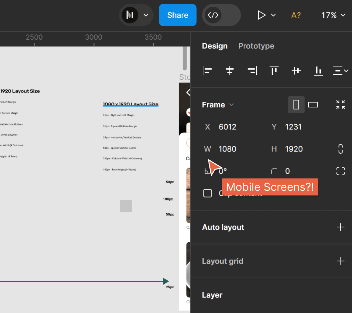
The previous designer used dimensions of 1080 x 1920 for the web, but this might cause issues during client presentations. The problem is that there isn't a device that fits exactly with these dimensions in the prototype. This could also create problems during development because things like font sizes and image dimensions won't match between the design and the actual product.
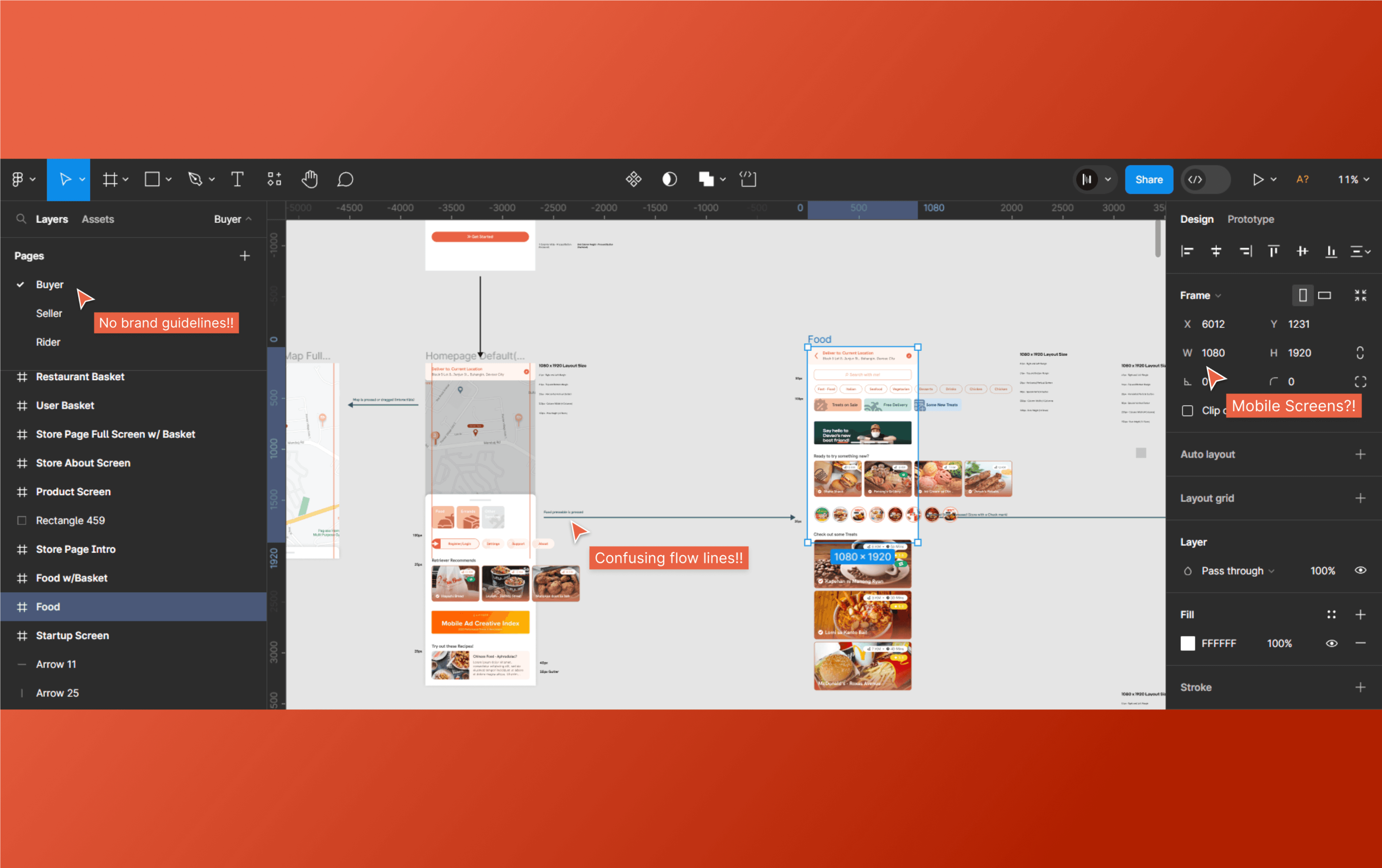
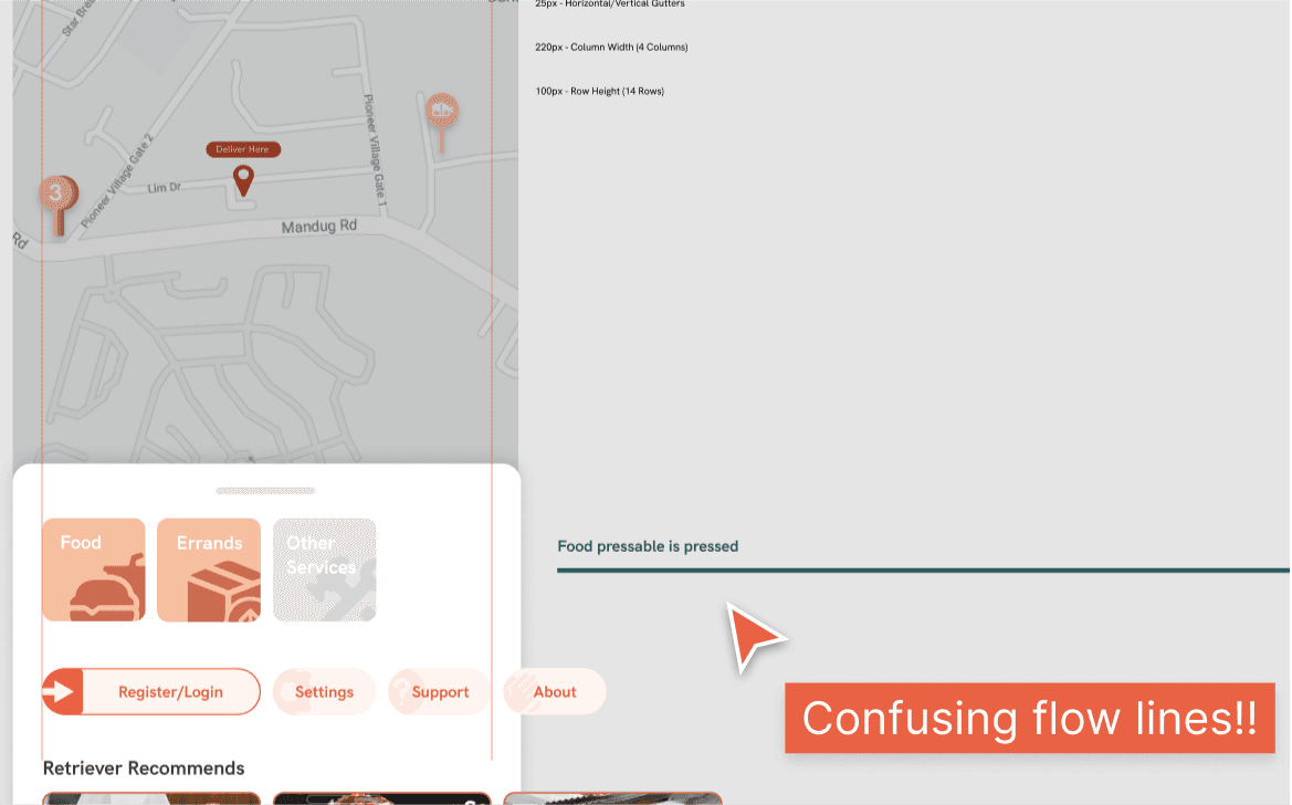
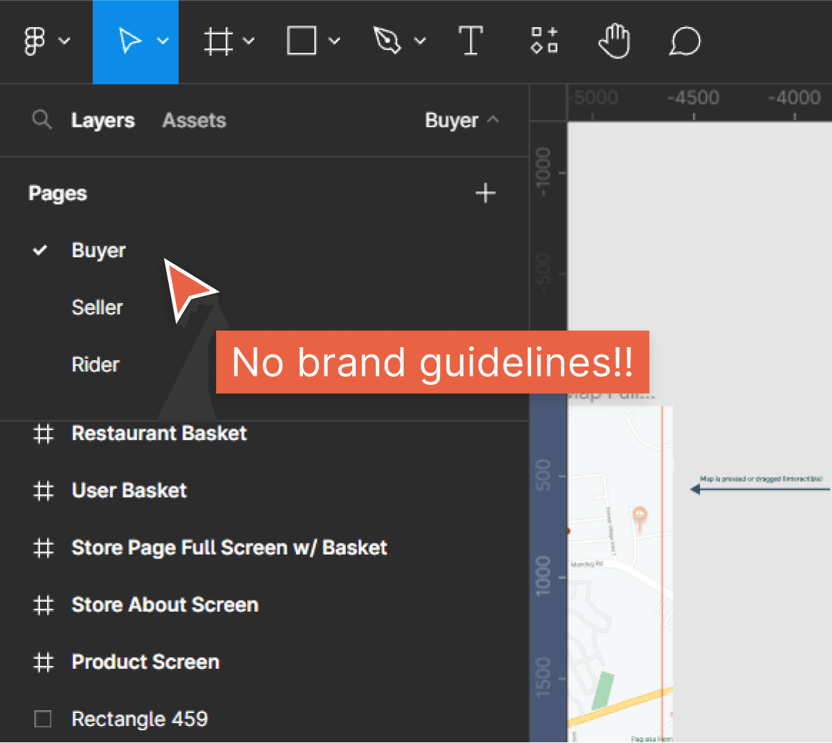
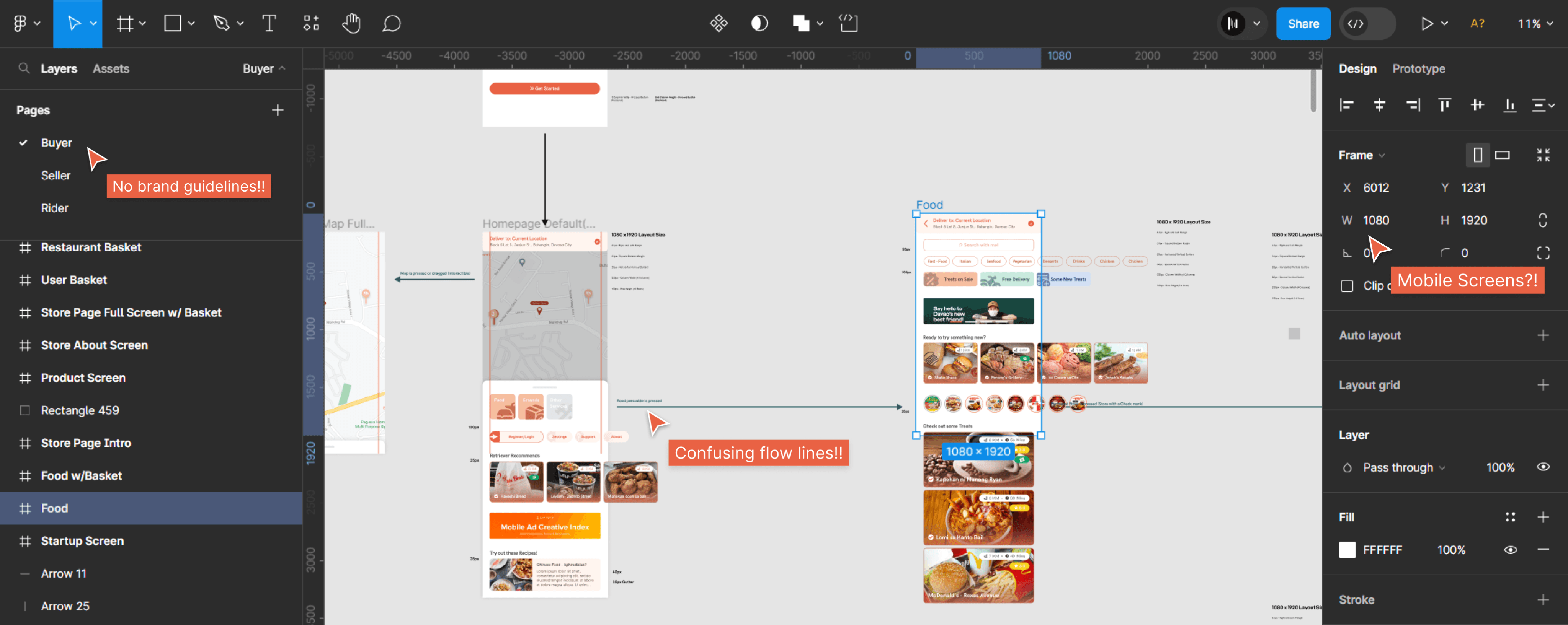
There are no clear design guidelines to follow, and the designs show a lot of inconsistency. Here are the sample screens from the previous designer.
TYPOGRAPHY AND COLORS
All typography and color choices must adhere strictly to the specified fonts and colors, which have been specifically selected by the client. The client strongly discourages the use of any fonts and colors that are not provided.
HK RTVR
Primary font
Criteria CF
secondary font
LAYOUT
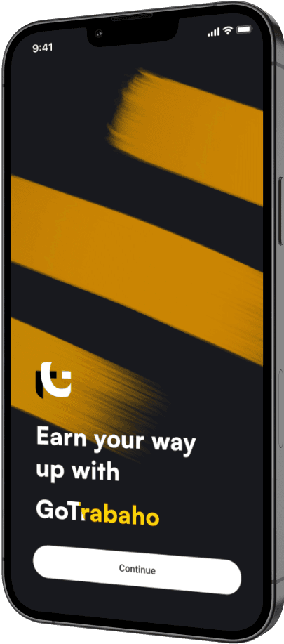
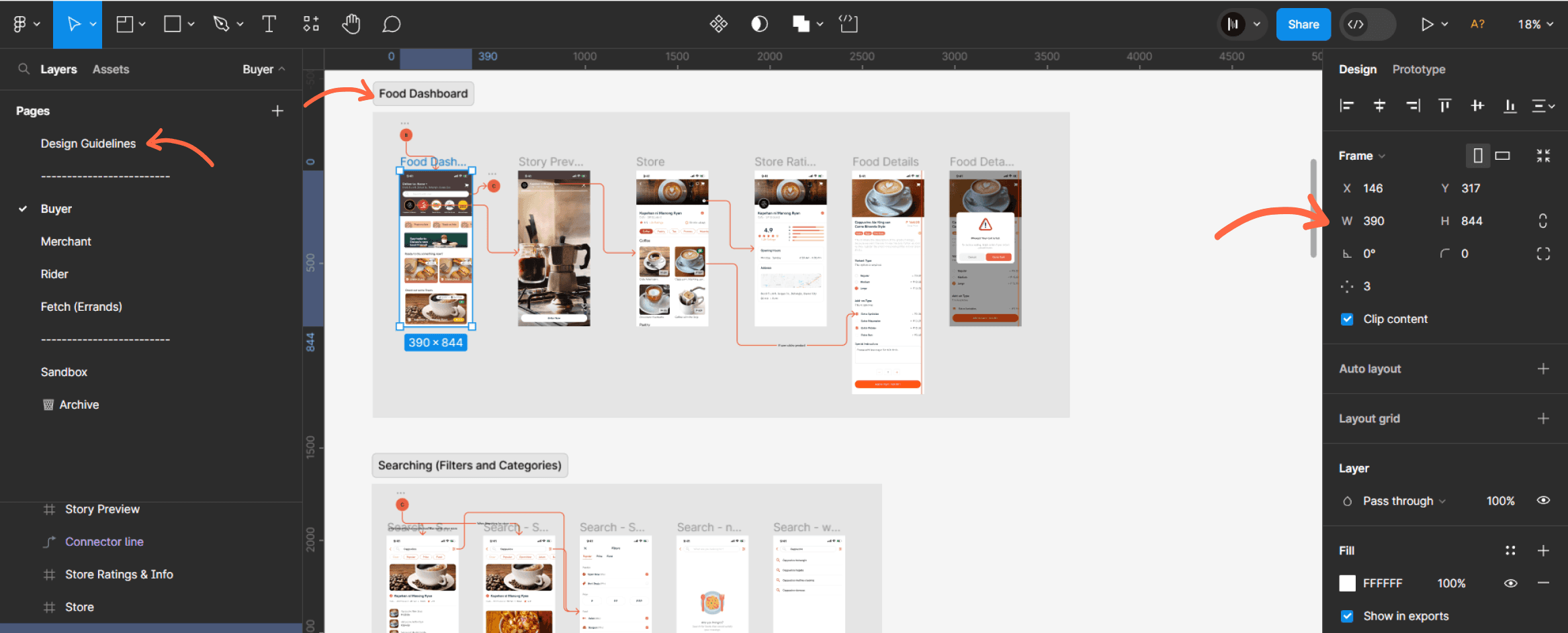
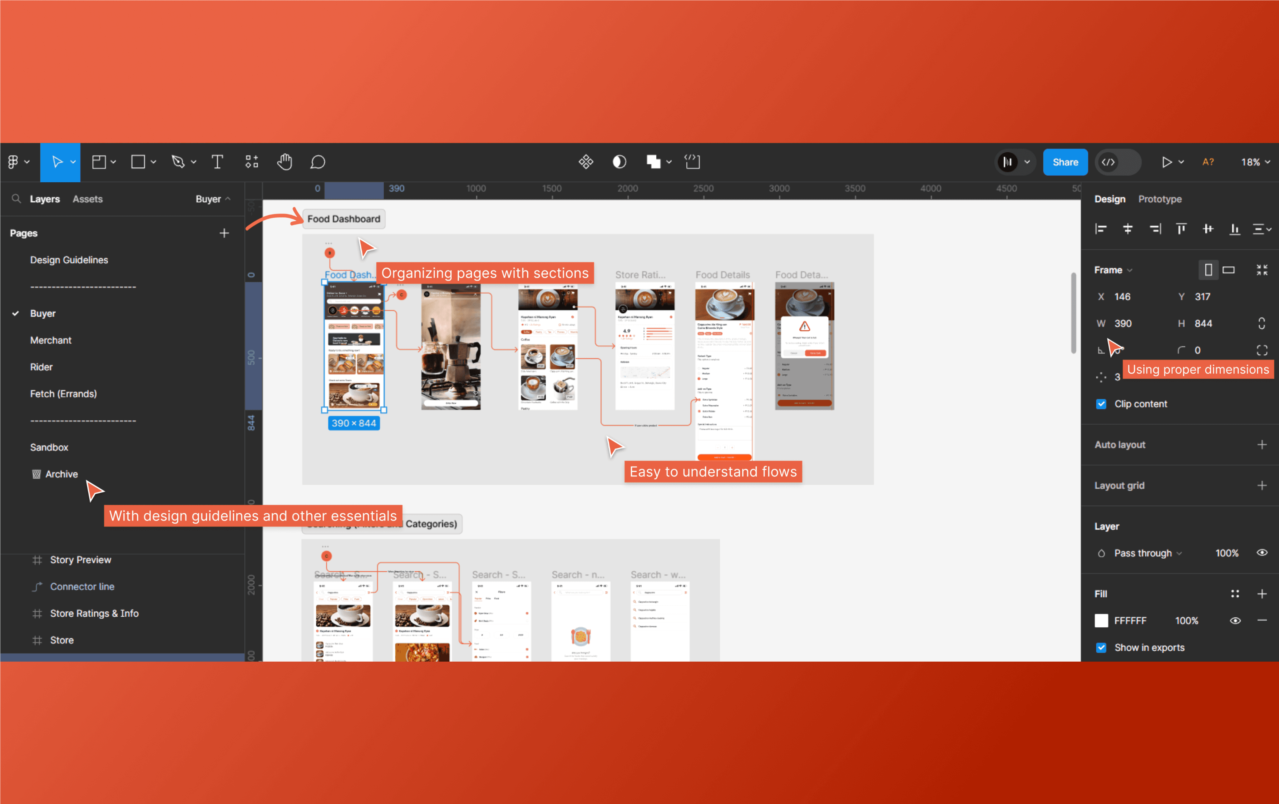
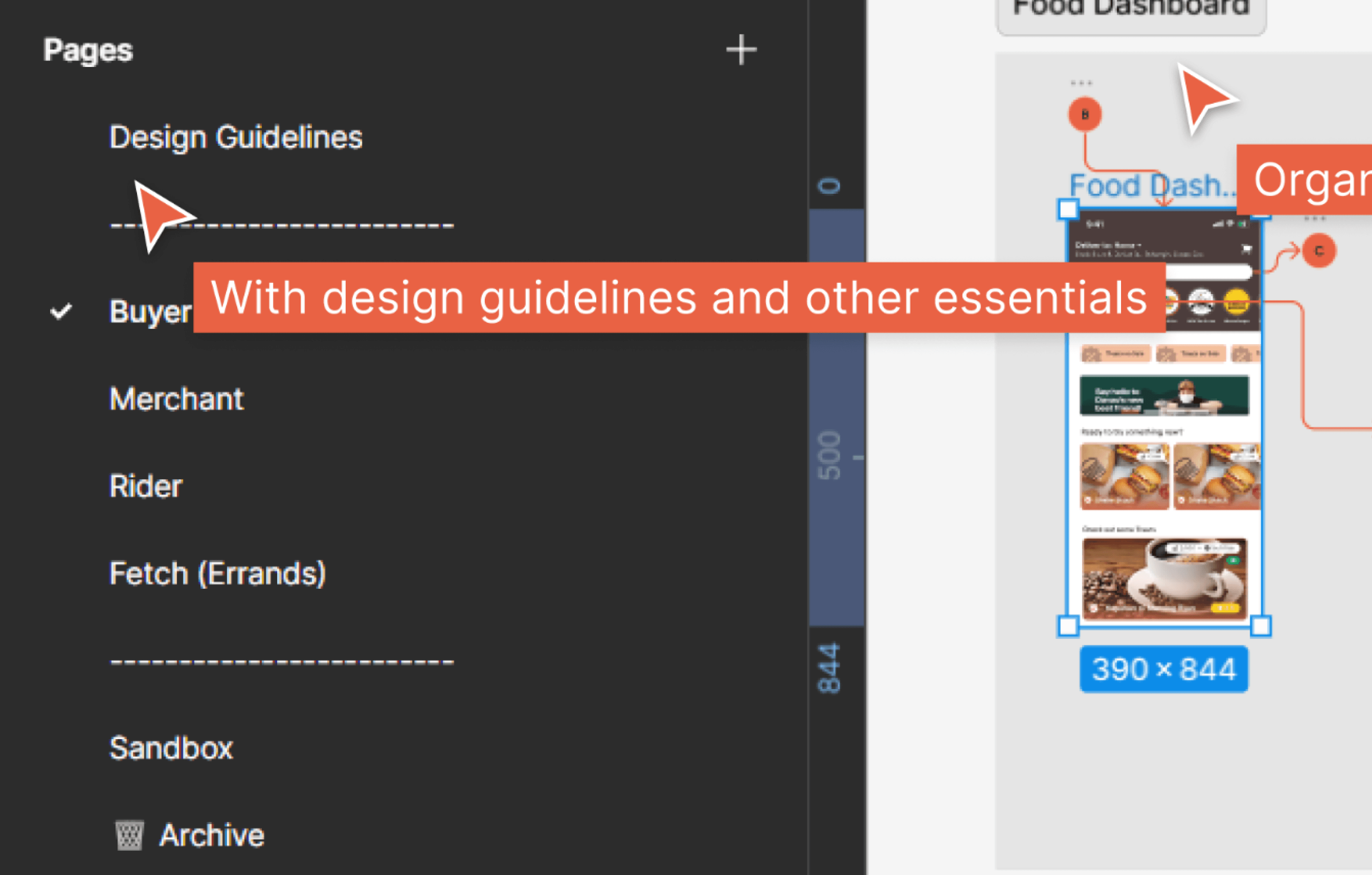
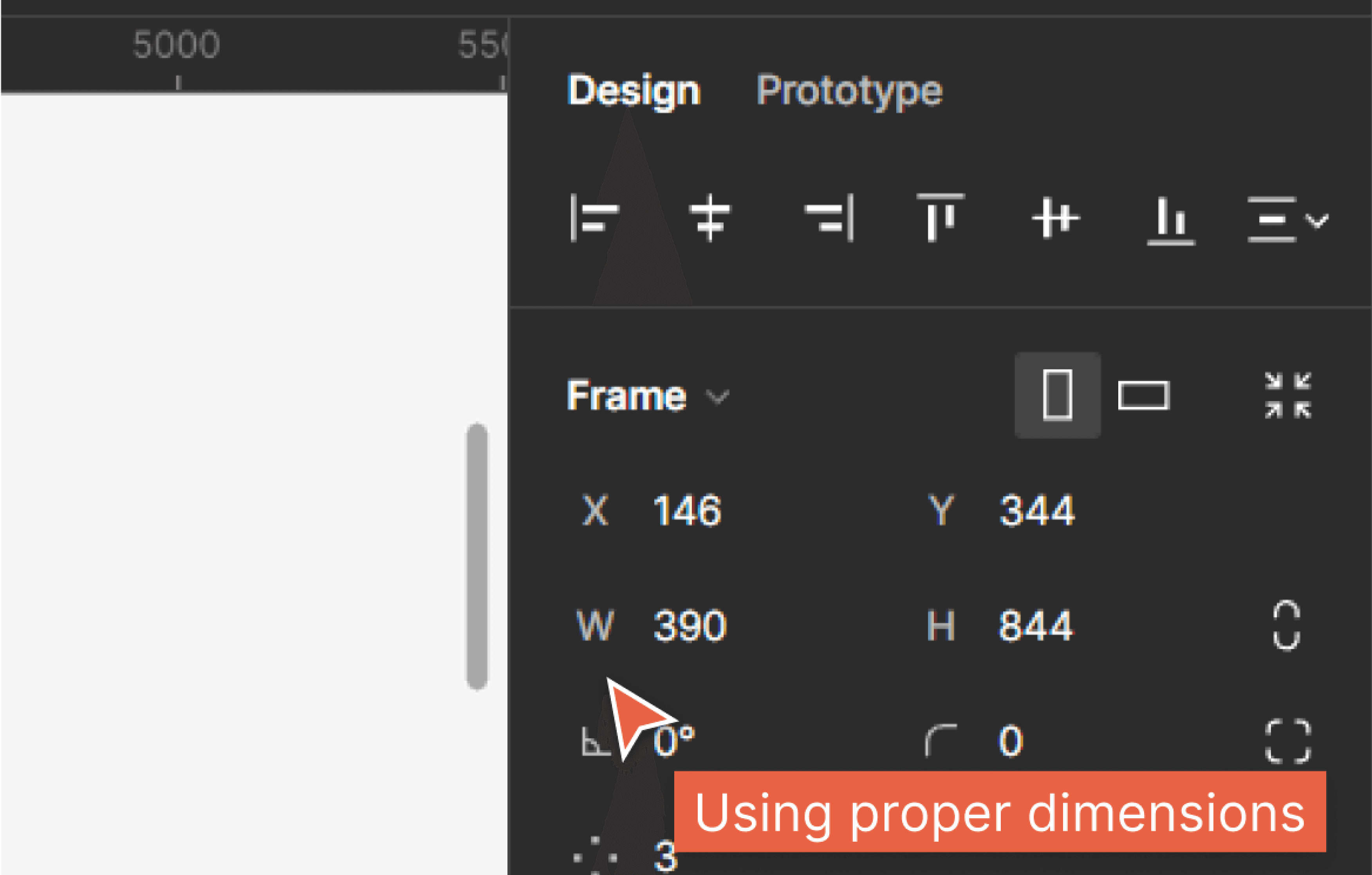
Recognizing the challenges stemming from the previous designer's choice of a 1080p x 1920p dimension in Figma for mobile design, which led to significant issues when translating dimensions for the developers, I opted for the iPhone 13 Pro dimensions, which were the latest available in Figma at that time. This decision not only enhanced the prototyping experience and improved the quality of our demos but also contributed to more efficient RAM usage within Figma.
DESIGN IMPROVEMENTS
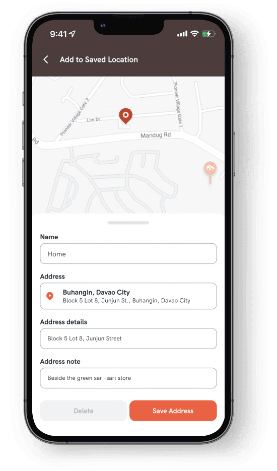
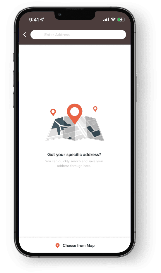
The main task in this project is to work on the missing page's design. However, I found the previous designer's file organization too confusing, so I decided to start fresh. I created a set of design guidelines and applied them to the existing pages. (Solutions for transition from the old design) The previous design had issues like inconsistent spacing and a confusing user experience flow. I addressed these problems and made improvements to the design.
FINAL DESIGN
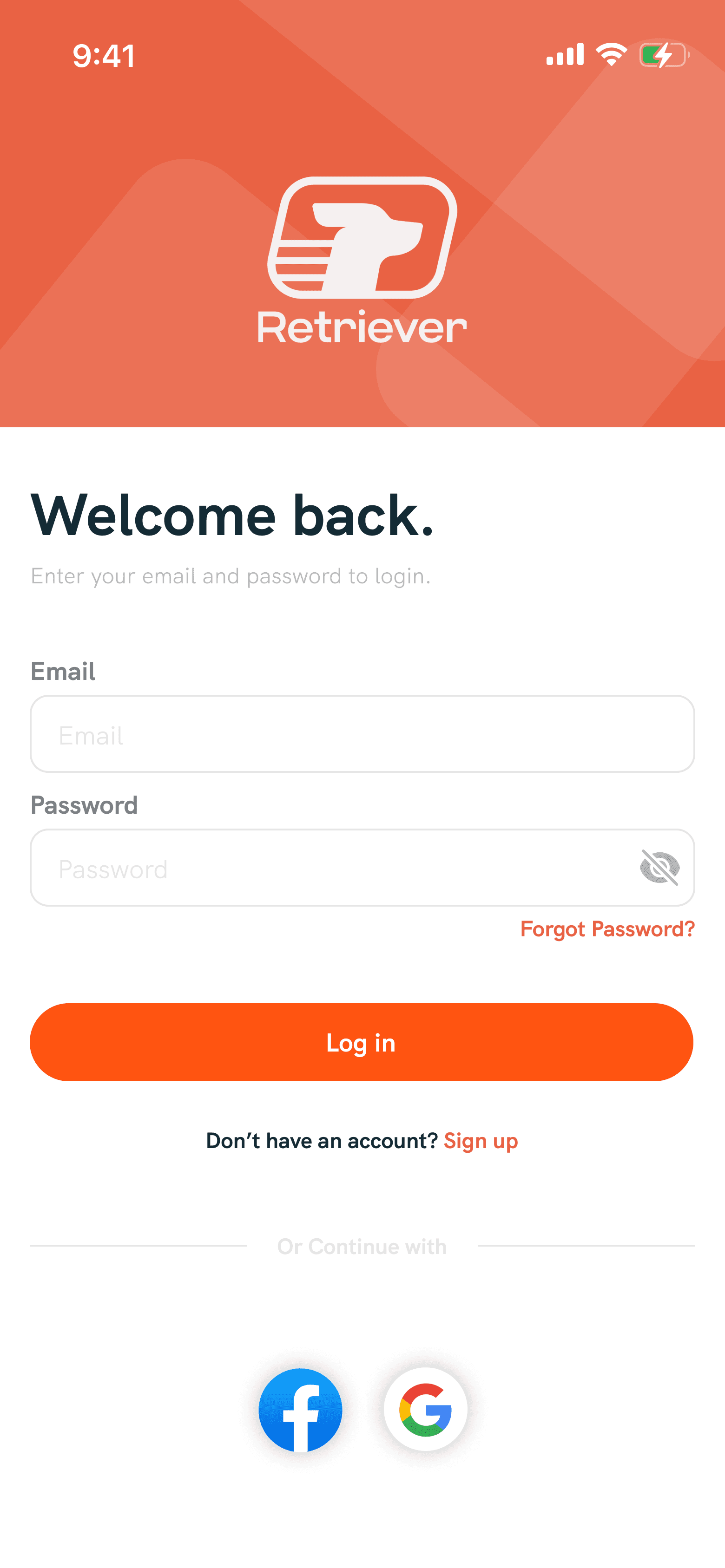
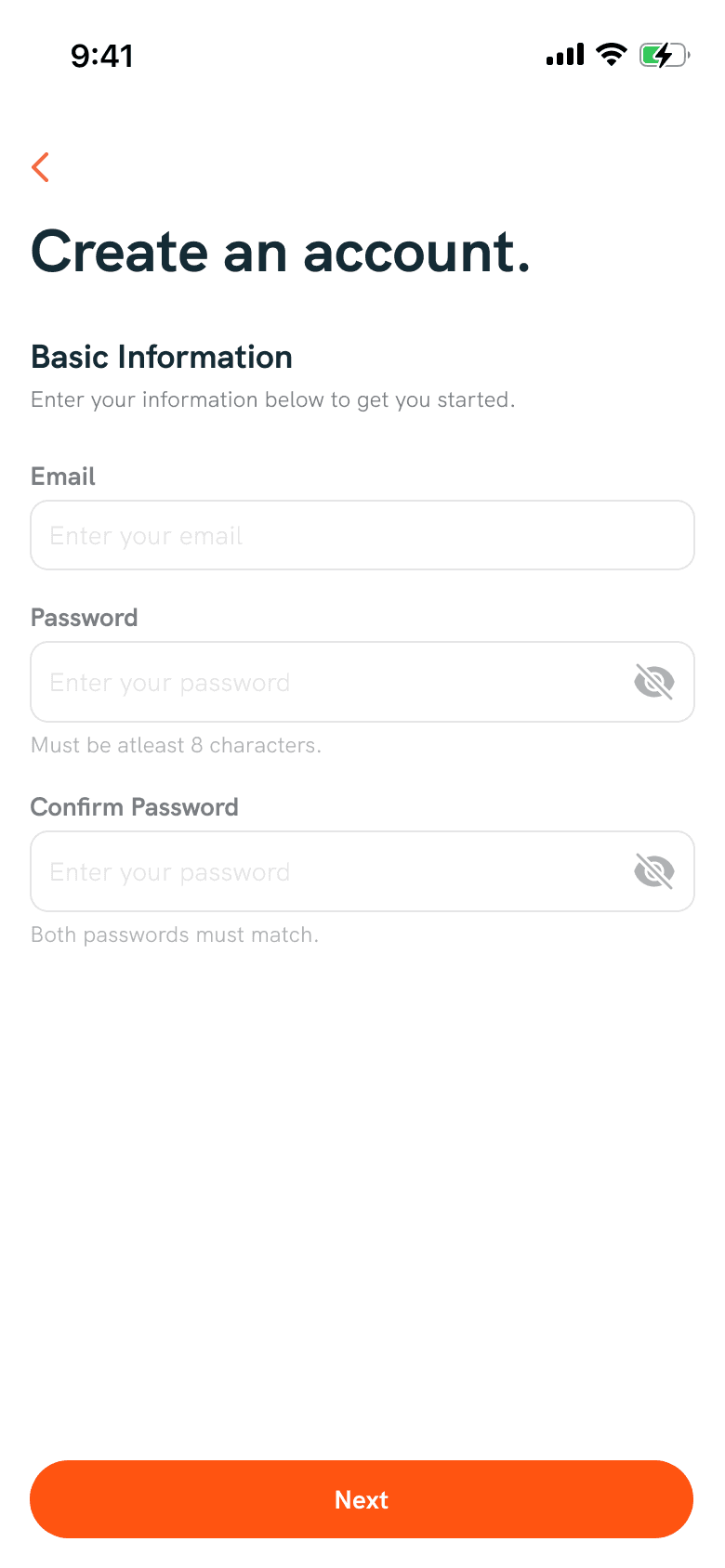
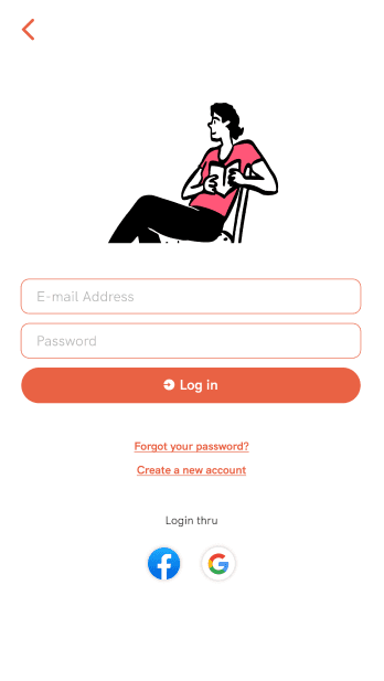
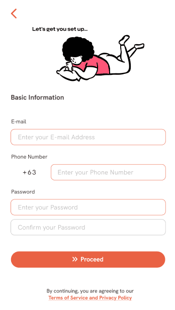
Sign UP / Sign in
In the previous design on this page, they used an orange outline around the text input fields. This might confuse users about whether they've already entered information or if there are incorrect credentials. In the new design, I changed the color and removed unnecessary illustrations that didn't match this page.
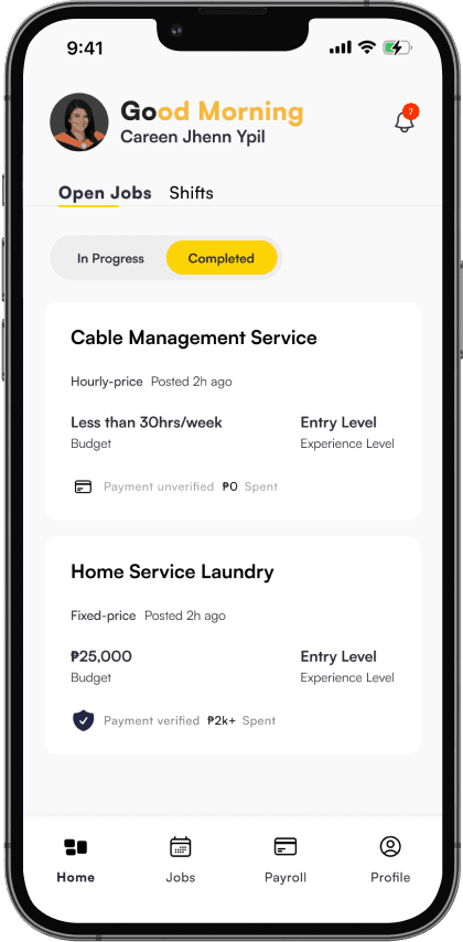
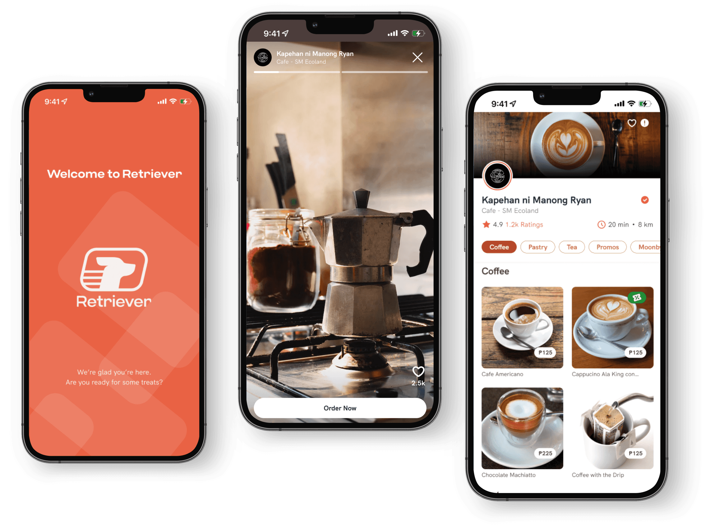
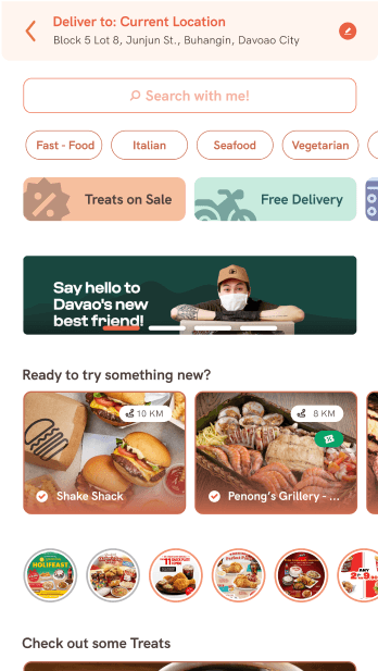
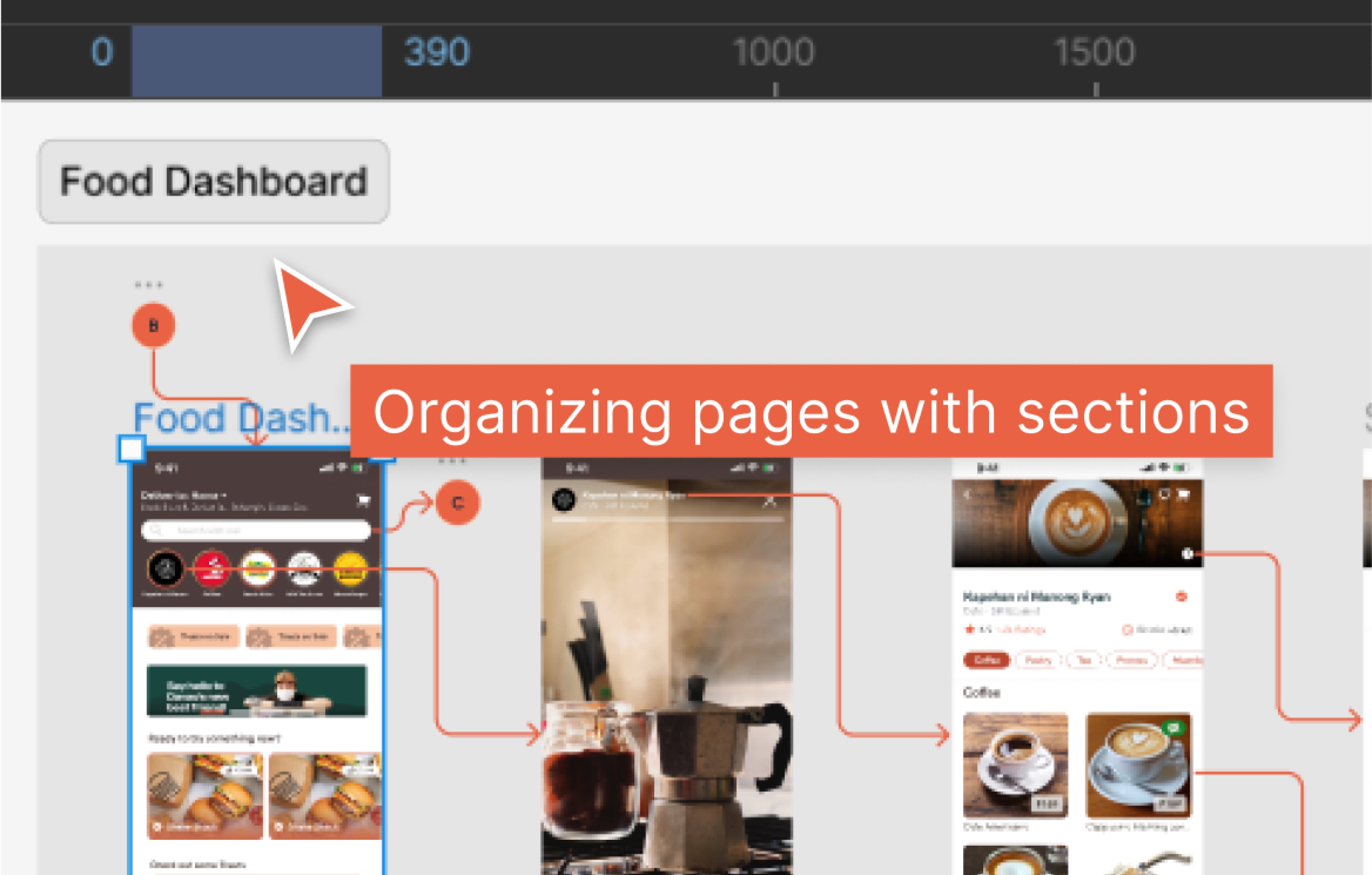
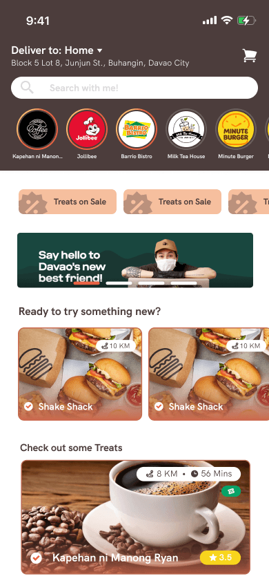
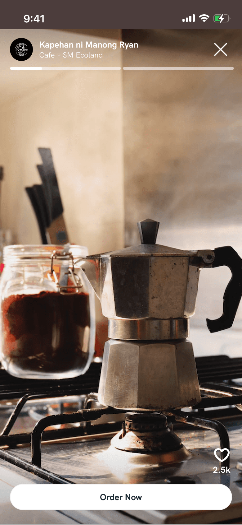
Food Dashboard
The previous design lacked hierarchy; it wasn't clear who or what had a specific position. In the new design, I organized things better. First, there's the story feature, followed by offers or discounts, and then the available food. This way, users won't get confused when looking at the dashboard. Additionally, I added indicators to the story feature to show if it's new or has been viewed, so users know if it's the latest or if they've already seen it.
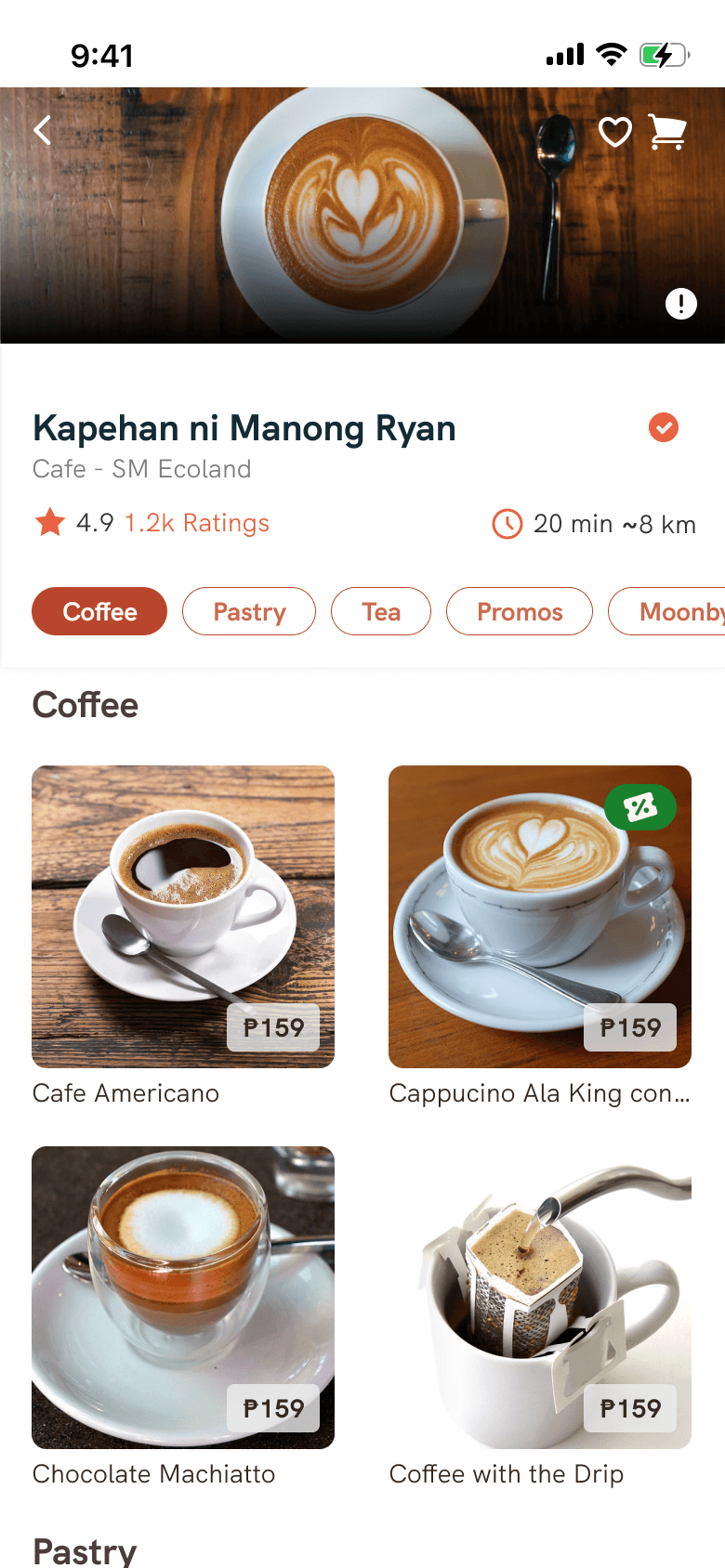
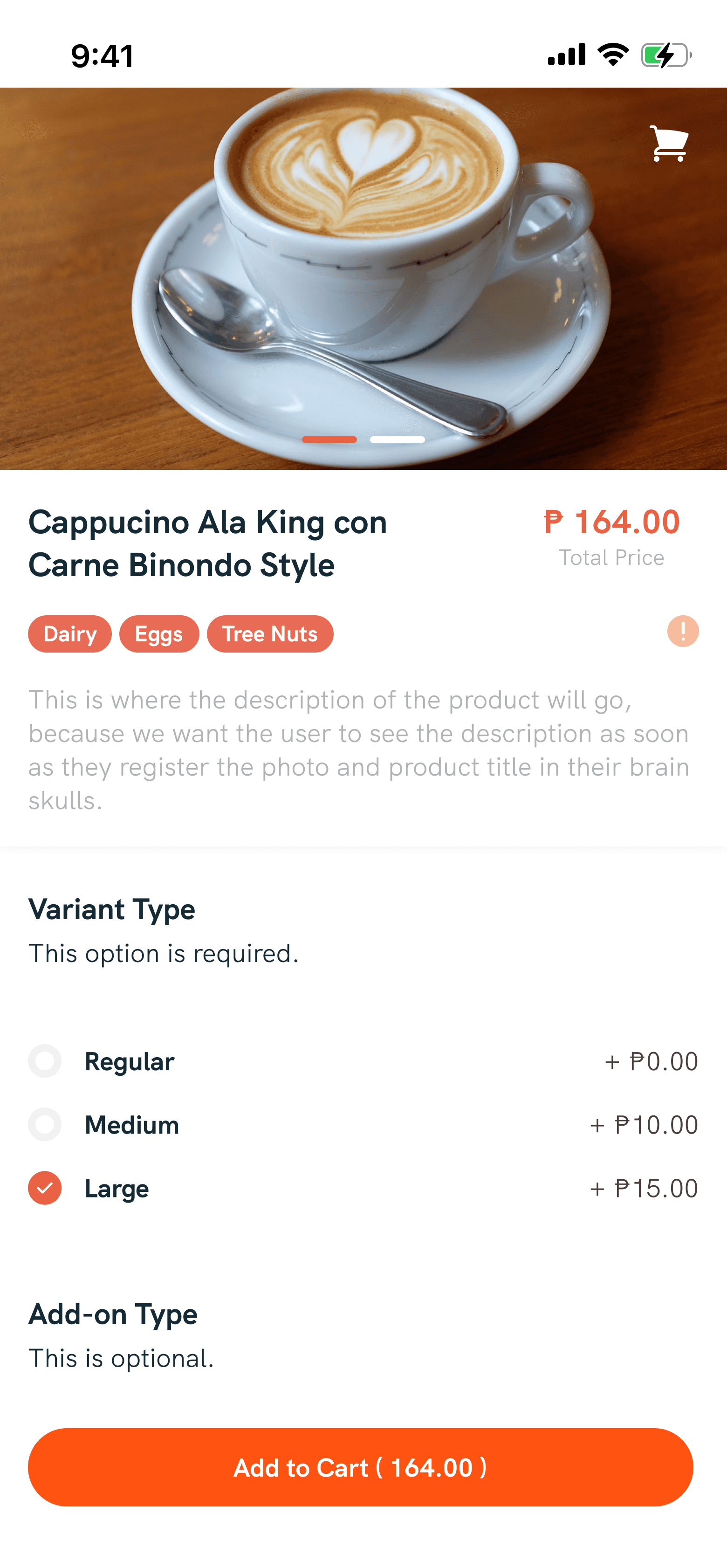
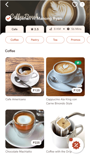
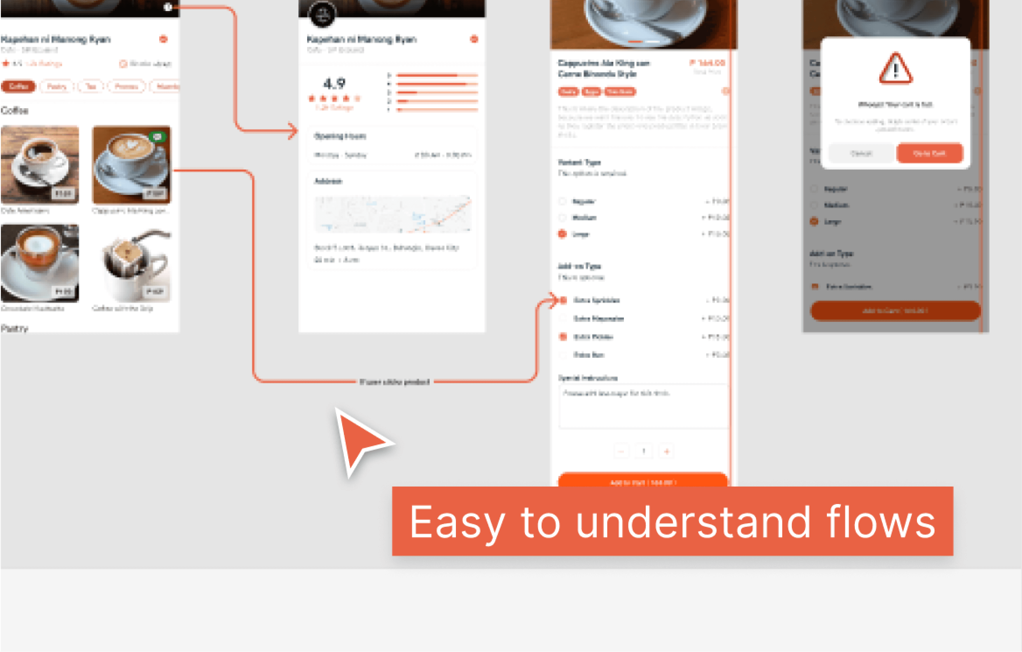
Product details
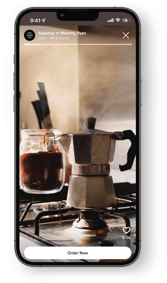
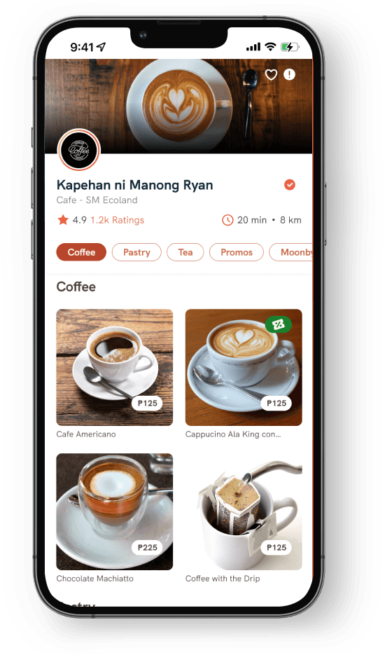
In the previous design, there were images with text, making the messages unreadable and creating a cluttered display for small restaurant details. In the new design, I emphasized to the client not to use cover images with text. This ensures a premium and consistent look across all restaurant detail pages in the app. I also optimized the position of the restaurant information for better presentation.
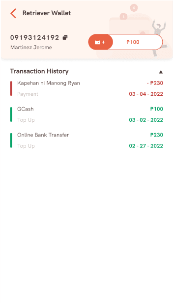
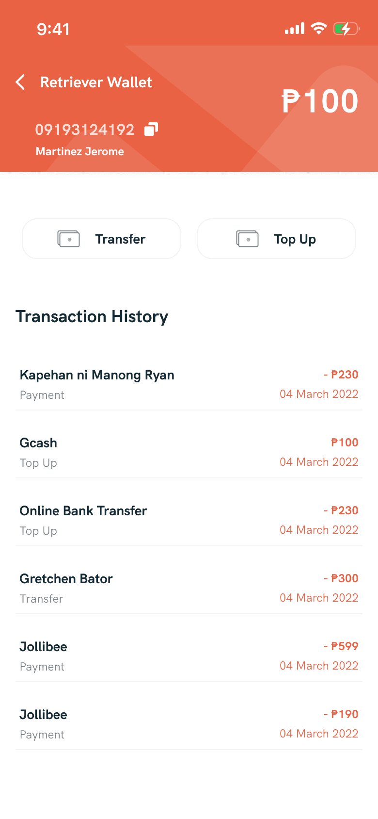
Wallet
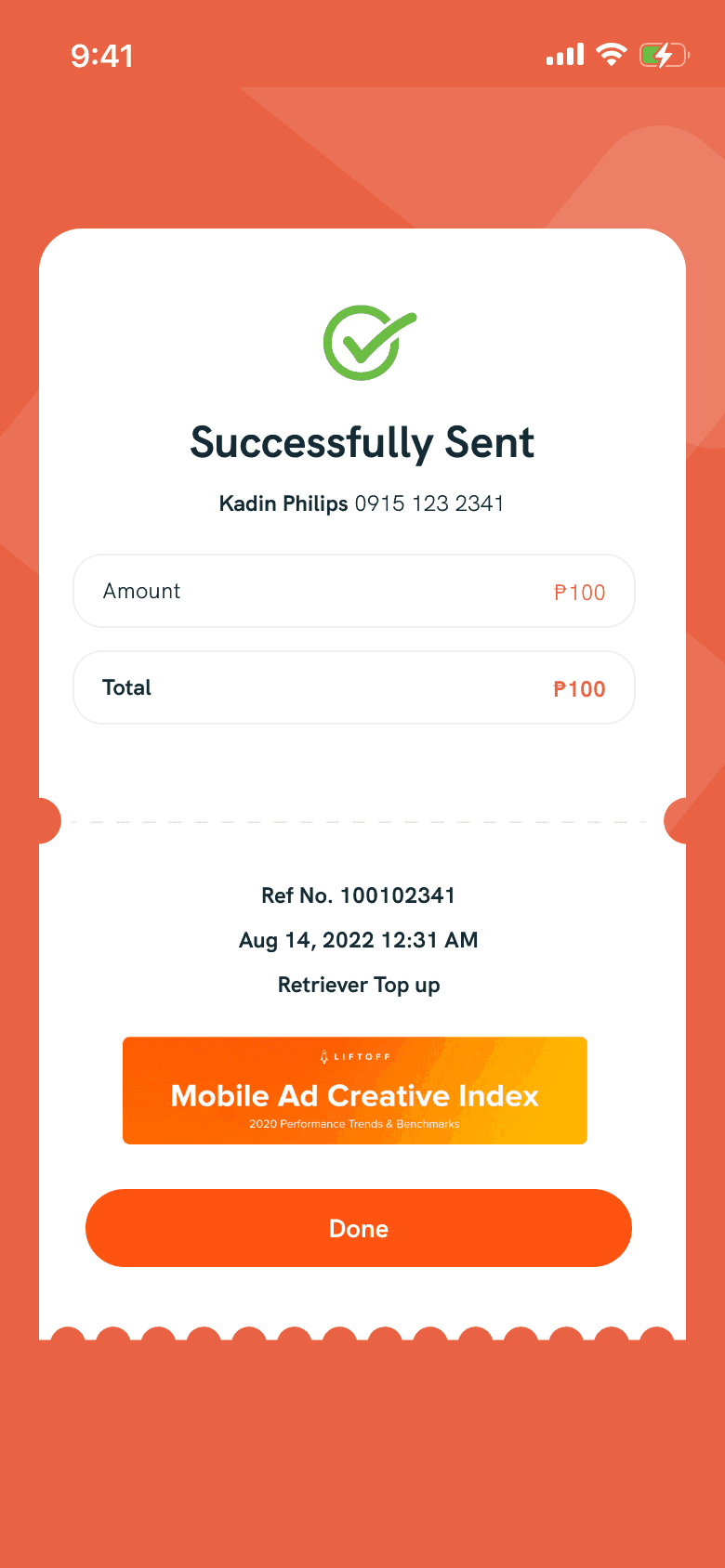
In the redesigned wallet screen, I improved the visibility of the available amount and created a cleaner design for the transaction history. This ensures a more user-friendly interface and streamlines the overall look. As an extra touch, I introduced a receipt screen to enhance the user experience, adding a sense of celebration when a transaction is successfully completed. This addition aims to bring a positive and rewarding feel to the overall interaction within the wallet feature.
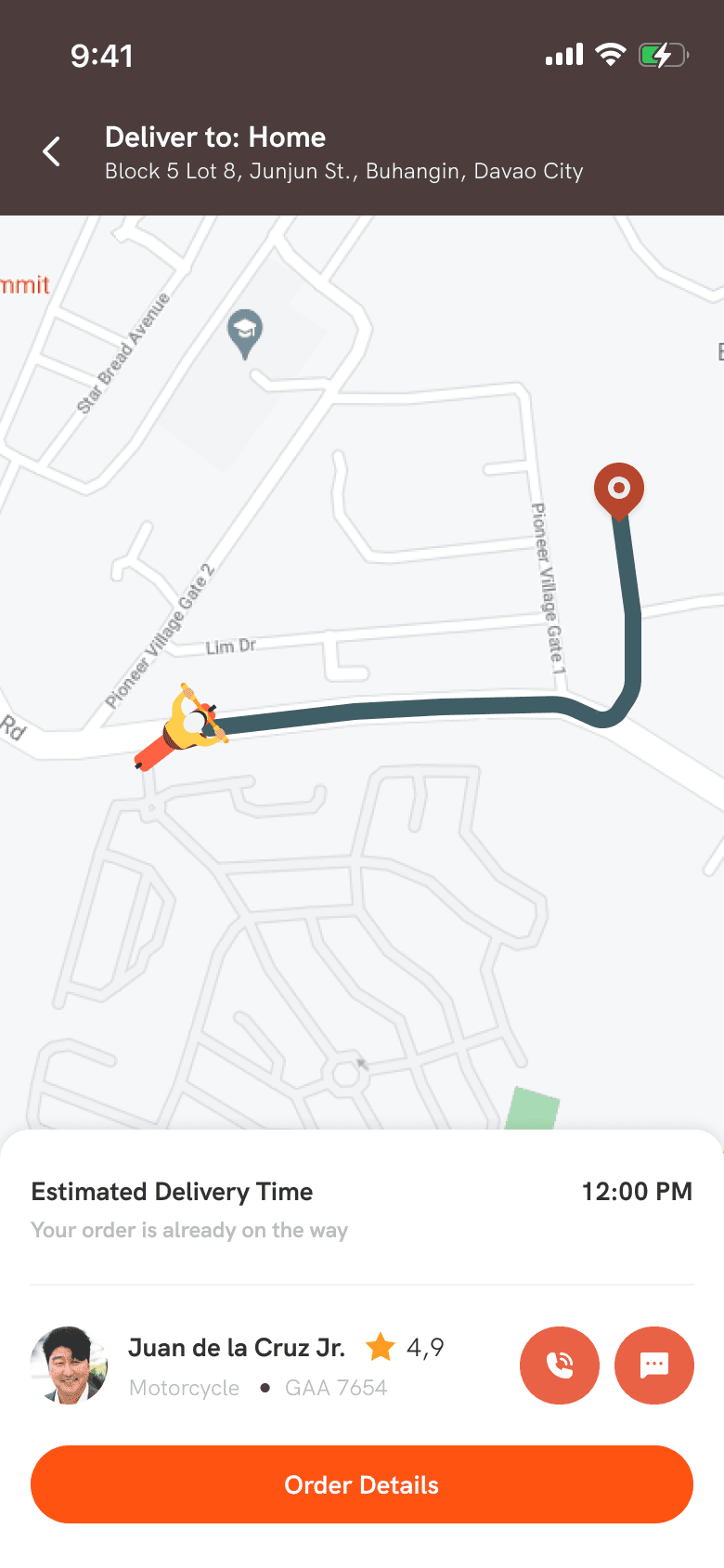
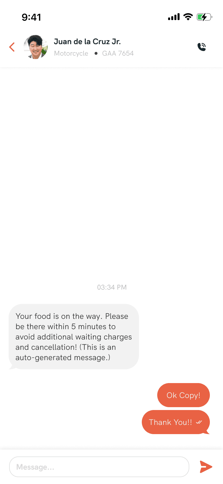
Order Tracking / Messaging
This feature is one of the pages that needs to be designed. In this screen, I kept the design straightforward, focusing on functionality without sacrificing aesthetics. This is because there's a shorter attention span expected from users on this page. Additionally, it's noted that prolonged user engagement on this page, due to the use of a live map from Google, can be costly.
50+ screens designed
While working on this project, I created a total of 54 screens. I focused on filling in the empty states, ensuring success messages were clear, and refining the details pages and forms for various actions. The project presented its challenges, but the satisfaction of successfully addressing these issues and meeting the client's expectations made it fulfilling.